
by Gabriel TenEyck
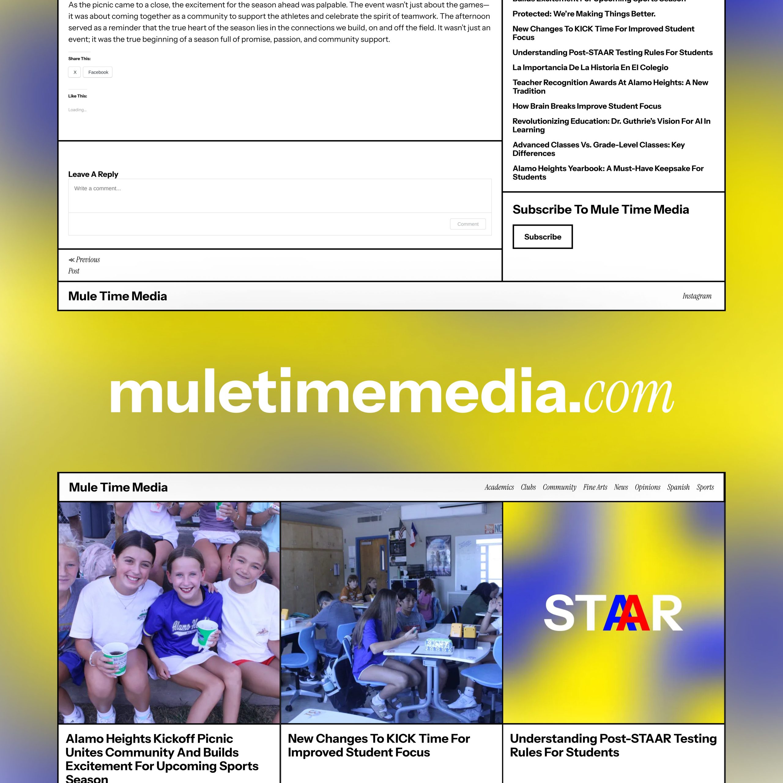
Hit refresh. The new muletimemedia.com is here.
This article breaks down all the upgrades to the website and the Mule Time Media brand as a whole. Our new website design is bold, playful, and unmistakably us. With a mobile-first design and our new commitment to accessibility and usability, the next level of Mule Time Media is here.
The New Look
Our website has a new, block style design, with every article category at the top, it’s easier than ever to find a certain topic. Photography from our student journalists is framed above the titles, and our branding is prominent everywhere.
Our new website was designed with accessibility in mind, so you can configure it in the new accessibility menu. You can visit it by clicking the accessibility button in the bottom right corner. We also comply with national accessibility guidelines and have baked in features to help those that need it.1
Why We Did This
We wanted to create a website that works for everyone. Updating accessibility makes sure all of our readers can navigate and enjoy our content, while modernizing the design makes the site faster, cleaner, and more fun to explore. In short, we’re leveling up so our site looks, feels, and works like the future of student journalism.
The new Mule Time Media website is also meant to take the first step toward consolidating our branding, this helps articles, photos, and videos all feel like they’re part of one cohesive Mule Time Media brand without the visual identity changing every video that shows up.
closing Notes
Soon, you’ll see more changes to our branding, making our image sleeker and more consolidated. Stay tuned, there’s more coming. Mules up!
[ays_poll id=3]
- muletimemedia.com follows WCAG 2.2 AA guidelines and has built in ARIA features.



Leave a Reply